
What Exactly Is Negative Space?
Negative space is defined as the space around and between the subject of an image. Negative space is one of the basic principles of any visual work; understanding what it is and how to use it is crucial in any visual art, especially graphic design.

Using Negative Space to Achieve Balance

credit Ruben Alexander
Considering negative space while planning the layout of any design composition helps to ensure visual balance between positive objects and negative space. Adversely, it can also be used to focus attention on the subject, through manipulating that balance intentionally. When you begin to consider negative space as its own design element, you see the image as a puzzle of interlocking shapes. When viewed this way, it is easier to manipulate the balance between positive objects and negative space, focusing the viewer’s attention to the subject of the piece.
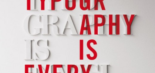
Negative Space as a Positive Object
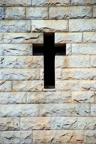
credit num lok via tumblr
Negative space can also be used as the subject of the image. In this example you see that the wall surrounding the cross is the positive object, but the negative space of the opening is the subject of the photo.
Negative space can also be used as its own positive element – this is called manipulating the figure-ground relationship, in designerspeak. When this happens, both the positive elements and the negative space communicate simultaneously, and generally combine to create a more complex message.

credit AIA New York via InspiredMag
This logo for The American Institute of Architects shows the buildings of New York as the slots in the key, combining to send a strong message about what they do.
Using Positive Objects to Define Negative Space
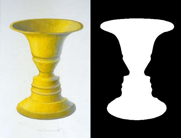
credit Rubin’s Vase via ArtDocents
One final way that understanding negative space can be helpful in design is to consider how positive objects can be used to define negative space, confusing the figure-ground relationship and creating visual interest. The most famous example of this is Rubin’s Vase, Where the shape of the vase defines the negative space as two faces pointed towards each other.
Here are some more examples of incredible understanding and use of negative space:

credit lexlogo40513
This is such an amazing logo. The body of the golfer forms the face of the Spartan, and the arc of the golf swing makes the plumage on his helmet.
The helmet itself, however, is negative space.
_________________________

This is one of the most famous examples of negative space in logo design. If you look closely, the space between the ‘E’ and the ‘x’ creates an arrow.
_________________________

This is also a nice example, the image of the road creates an ‘H’ in negative space.
H is for HillRoad.
_________________________

credit nashifan via LogoPond
Ever since I first saw this logo I’ve been in love with it. The face of the lion is so well done, using negative space to fill in the outline of the lion’s head.
_________________________

credit M.C. Escher via ArtDocents
I had to give a nod to the classic, M.C. Escher. His work confusing the figure-ground relationship was instrumental in the development of understanding negative space.
_________________________
Share Some of Your Examples!
Have you used negative space in any of your designs? Seen any great examples of negative space? Feel free to share them in the comments; I look forward to seeing what you’ve found. As a special treat for reading this far, here is an amazing artist that specializes in all of this. This gallery is definitely worth a look. http://www.dutchuncle.co.uk/noma-bar-images/
