
Typography is one of graphic design’s most fundamental principles. Some people think that typography is all about just choosing the right font and running with it, and although font choice is important, there is so much more to the world of typography. Proper typography can make or break a design by affecting the visual appeal, flow, and most of all the ability to communicate effectively. In this first installment of The Typography Series, I’m going to introduce you to the basic principles of typography.

Choosing the Right Font
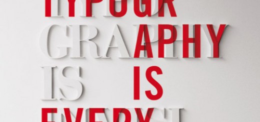
Credit tarrytown
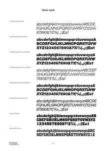
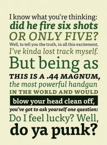
Font choice is crucial to any design, and there are several factors to consider when making that decision. The decision comes from how you want your design (and specifically the lettering) to be perceived. The choices tend to come down to options like these: traditional or modern, masculine or feminine, playful or serious, loud or quiet, etc.
There are a vast multitude of font choices out there and nailing down which ones you want to use can be arduous and exhausting process if done properly. This might help narrow things down a bit – all fonts can be put into one of three categories: serif, sans serif, and decorative.
Serif is generally perceived as being more traditional and serious, sans serif is generally more modern and playful, and decorative fonts should never be used for bodies of text. You should also avoid using more than 3 different fonts in any design.
Color and contrast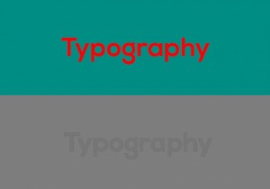
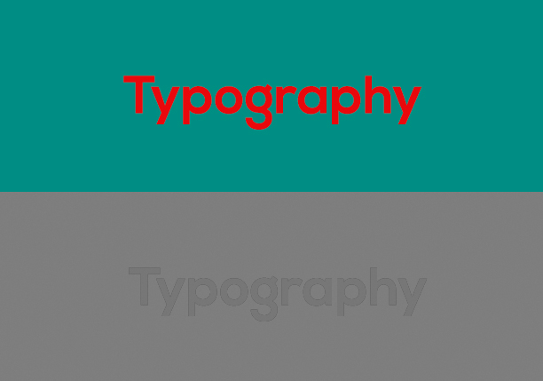
I combined these two because they really tend to mean the same thing. When choosing the colors for your typography, contrast should be your main concern. Contrast directly influences readability, and should be taken seriously.
Proper contrast can be attained through a difference of not just hue (color choice), but value (shade of that color from dark to light) is equally important. One great way to test this is by making the design grayscale. If your words are hard to read when in grayscale, the contrast is not what it should be.
Size and Weight
credit Lauren Manning
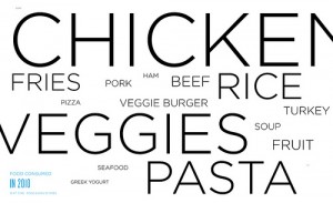
The size and weight of your font is another huge factor to consider when working on the typography of a design. Varying the size and weight of the text can draw the viewer’s eye around your design, and help with flow and visual hierarchy.
Concentrating on flow and visual hierarchy through properly chosen size and weight of the type helps you get your message across effectively. This is one of the main factors to consider, because if your message is communicated to the reader out of order, it may say something you did not intend and will not be clearly understood by the viewer.
Leading
credit FontFont
Leading (or Line-Height in designer speak) has to do with the space between lines of type. Generally, this is set at a default of 120% the size of the type, but can be manipulated to really help you get your point across. Changing the leading can help you group pieces of information so that they are viewed together, or they can separate just as easily.
Once again, there are pitfalls to manipulating the leading of a design – lines too close can appear squished and lose all effectiveness, lines too far apart won’t be associated with each other and chop up your message.
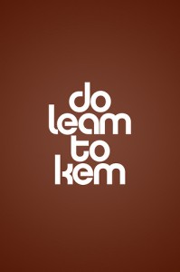
Kerning
credit Brett Jordan
Kerning is a term that refers to the space in between the individual characters. Most typefaces are set with defaults that are highly inconsistent letter-to-letter, and proper kerning is one of the quickest ways to determine if typography principles have been applied or if the information was just typed and published.
Kerning is an awesome tool that can be used to completely change a design. Proper kerning can make a design perfectly readable so that the information just seems to jump into the viewer’s brain, and improper use of kerning (or no use at all) can achieve the exact opposite.
See how much more there is to typography than just choosing a font? And these are still just the basics – the tip of the typographical iceberg, if you will. One thing I must mention in this article is that all rules are meant to be broken. Typography is a fluid, ever-changing subject and it continues to evolve even today. The only way to truly come up with a brilliant typographic design is to know these basics, and from an educated standpoint, choose whether to follow them or not. Typography is an art unto itself.
What do you think? Do you agree, disagree? Feel free to share with comments below.
See Also:
The Typography Series #2: The Good
The Typography Series #3: The Bad.
The Typography Series #4: The Ugly

Pingback: The Typography Series #3: The Bad - The Spark()
Pingback: The Typography Series #2: The Good - The Spark()