
10 Examples of Really Ugly Typography.
This is the final installment of The Typography Series, and I want to wrap things up by really showing you what can happen if you don’t give typography the proper attention. I know I touched a little bit on some poor designs in The Bad, but sometimes the consequences can be quite severe. The message you end up sending to the public may differ a bit from your original intended message. Here are 10 examples of typography gone wrong.
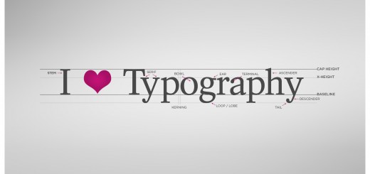
If you haven’t checked out the first three installments in this series, see them here: The Typography Series #1: The Basics, The Typography Series #2: The Good, and The Typography Series #3: The Bad.

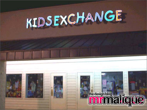
credit Typohile.com
Logo for the Kids Exhange. Boy, that really means something different without the space.
_________________________
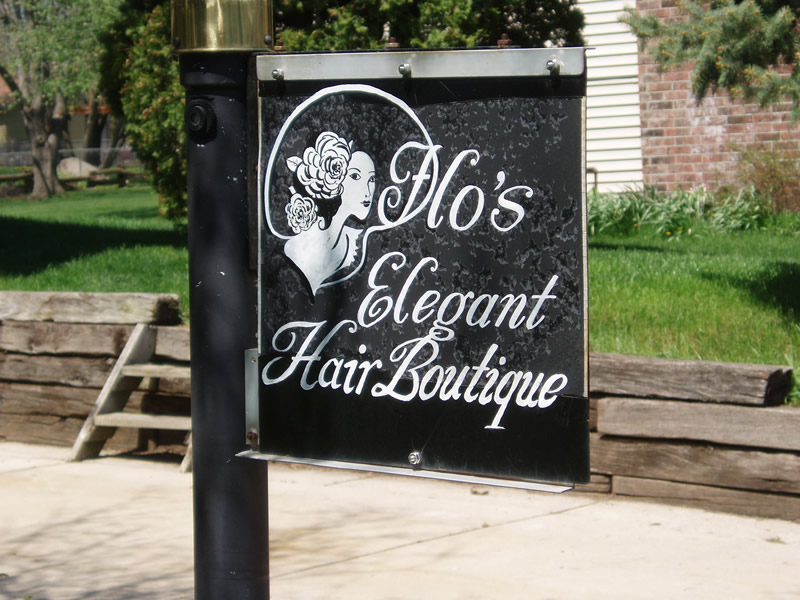
credit juliegomoll.typepad.com
This says Flo’s, but the unfortunate font choice makes it look much racier.
_________________________
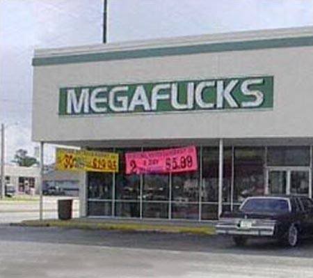
credit Kirsten Mosca via tumblr
This sign is supposed to say MegaFlicks. Kerning is crucial.
_________________________
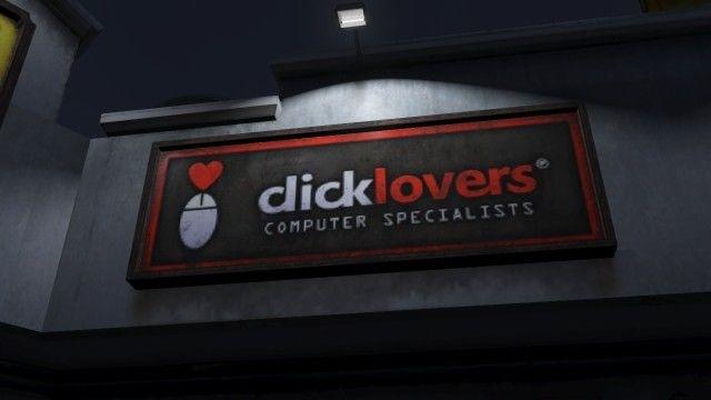
credit TheFontPolice via tumblr
This is the logo for ClickLovers. Ligatures should be used sparingly.
_________________________
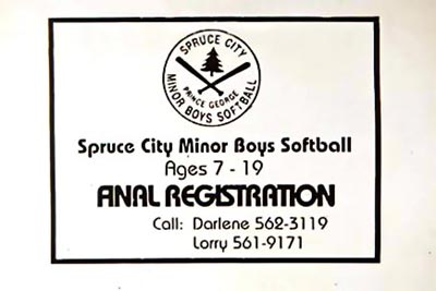
Once again, kerning and font choice. That says Final Registration.
_________________________
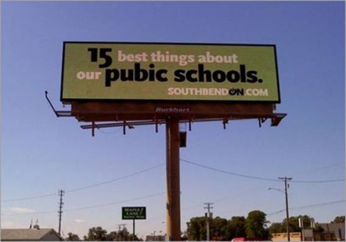
Proofreading is a must in graphic design. Sometimes misspelled words are actual words.
_________________________
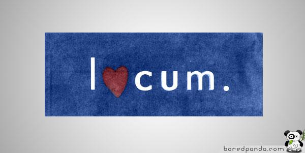
credit BoredPanda.com
This is a logo for a company called Locum.
_________________________
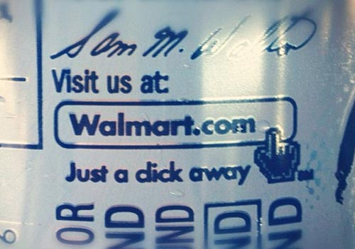
I’m sure that’s not what they meant. Although….
_________________________
credit TheAdamskiii via Reddit.com
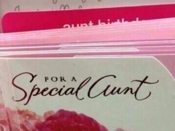
For a Special Aunt. That’s an A.
_________________________
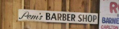
I’m pretty sure this says Pem’s Barber Shop.
See Also:
The Typography Series #1: The Basics
The Typography Series #2: The Good
The Typography Series #3: The Bad.

Pingback: The Typography Series #3: The Bad - The Spark()