
10 Examples of Really Poor Typography.
Yes, I know that in my post The Basics I said that rules are meant to be broken. I didn’t mean that you can just throw them out the window, they are still very important. Bad things can happen with typography if it’s not done correctly. I’ve compiled a set of 10 examples of really poor typography for your learning and enjoyment.
If you haven’t checked out the first two installments in this series, see them here: The Typography Series #1: The Basics or The Typography Series #2: The Good.

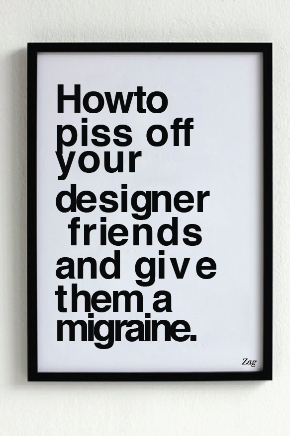
Seriously. I had a hard time with this one because I have to look at it every time I check this post.
_________________________
credit typedesk.com
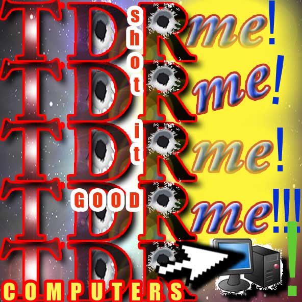
This one needs no explanation. I don’t even know what to say.
_________________________
credit Alisa May at aged4243may
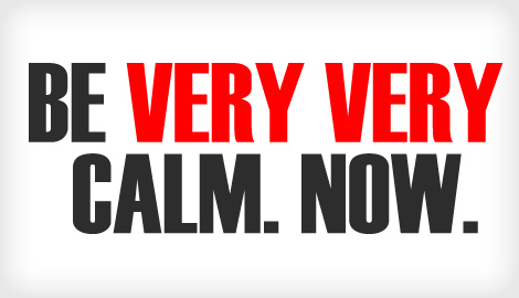
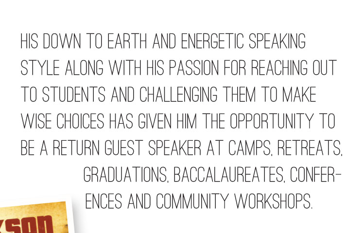
Bold, condensed font. Black and red on a white background. All caps, lines close together.
All the opposite of calming.
_________________________

credit Kirsten Mosca via tumblr
I have a personal problem with the typeface Papyrus (and its gross misuse), and this is a perfect example. Why?
_________________________

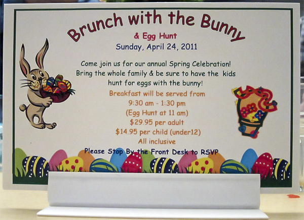
Misuse of quotes is another one of my pet peeves. Try this exercise: read this sign aloud, and make finger quotes in the air while you’re saying “we care.” How genuine do you feel?
_________________________
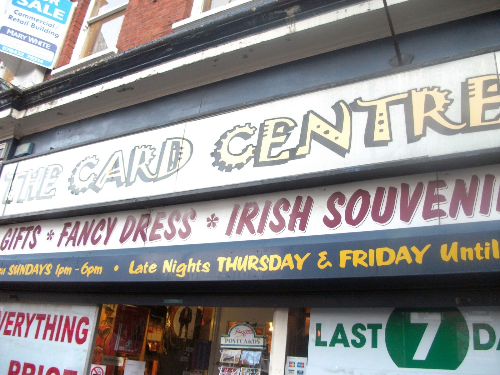
credit Charmaine Kelly
This is just too much. Too much colors, fonts, styling, sizes, everything.
_________________________
credit TheFontPolice via tumblr
Body text of all caps with a thin compressed typeface is nigh unreadable.
_________________________
credit KimCharlesInventive
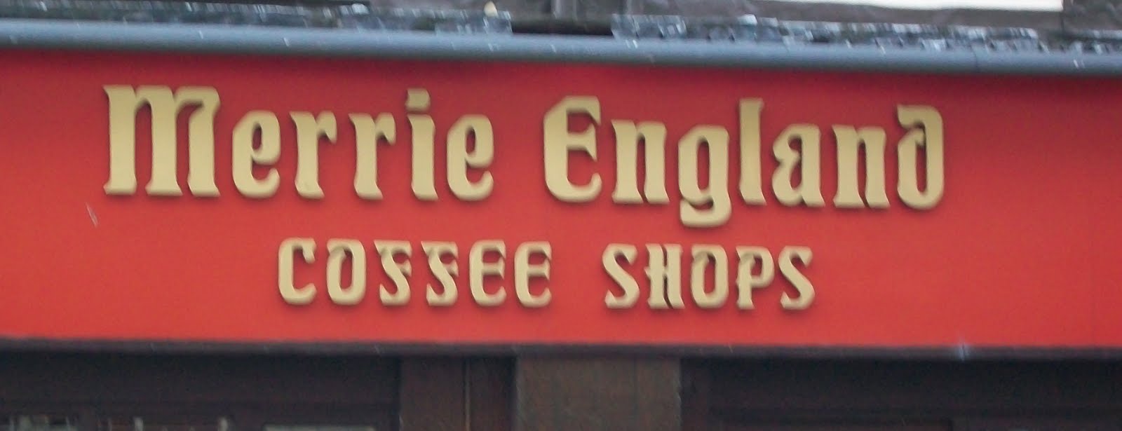
That word is ‘Coffee’, not ‘Cossee’. I think.
_________________________

This is crazy and looks like a 4th grade presentation. I can’t even concentrate on what it says.
_________________________
Comic Sans is to be avoided at all costs, especially in a professional environment.
See Also:
The Typography Series #1: The Basics
The Typography Series #2: The Good
The Typography Series #4: The Ugly


Pingback: The Typography Series #2: The Good - The Spark()
Pingback: The Typography Series #1: The Basics - The Spark()