
10 Examples of Good Typography.
So now that we’ve covered the very basics of what to look for in proper typography with the first installment of this series The Basics, let’s take a look at 10 beautiful examples of typography done well. If you haven’t read the first article in the series, you can find it here.

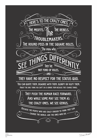
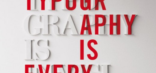
credit Thomasz Biernat via posterama.co
There is so much amazing work going on in this poster. The typeface is perfect, and it maintains awesome readability.
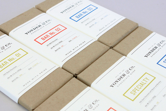
credit Alex Register via thedieline.com
This is fantastic minimalist product packaging design. I love the typeface they chose for the main label text, and how it is so different from the typeface in the logo.
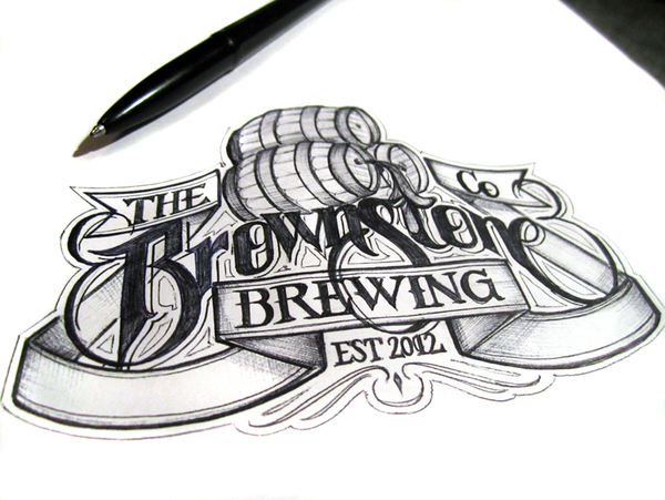
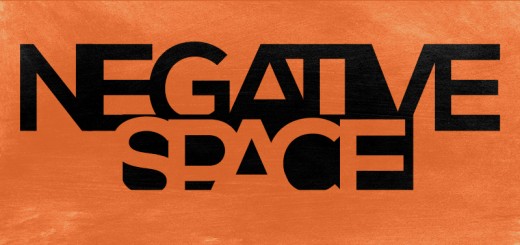
credit Martin Schmetzer via Behance
Definitely check out this guy’s work; he does hand-drawn typography that is so perfect and gorgeous.
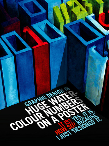
credit Shaun Morrison via flickr
I love the way this entire poster is done, but the main typography is fantastic. The typeface is clean and modern, the colors are varied in hue and saturation for contrast, and the concept is awesome.
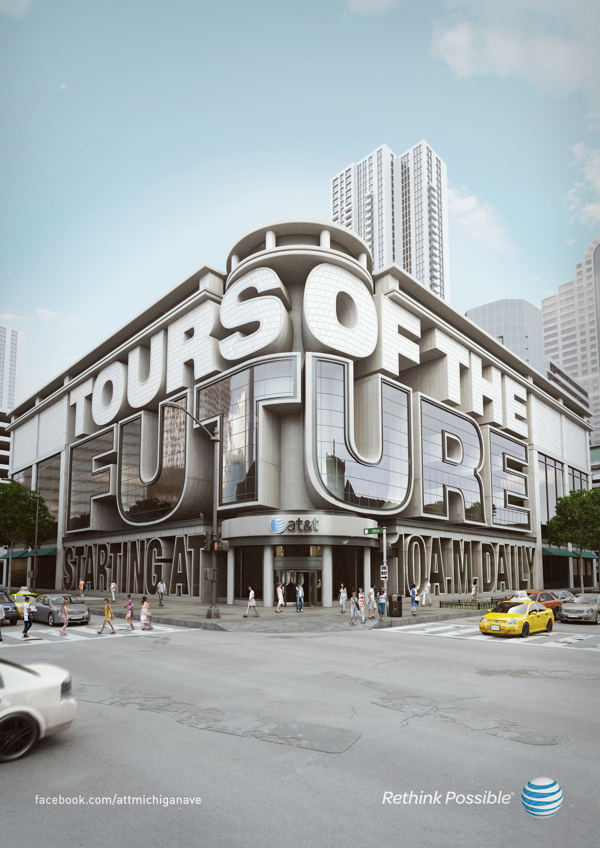
credit Chris LaBrooy via Behance
This is an incredible example of 3D Typography.
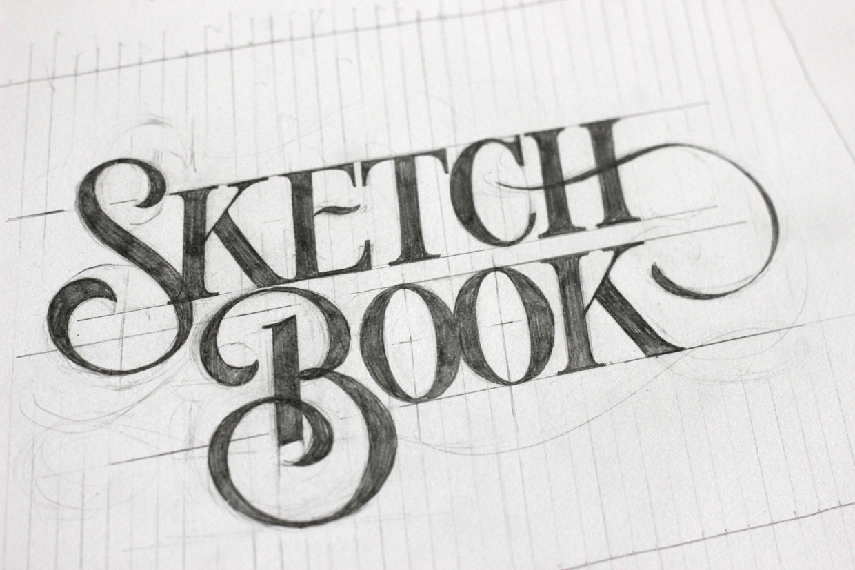
credit Ged Palmer via Behance
I just love this sketch; it shows some of the lines constructing the typeface, the leading and indent on the second line are perfect, and the typeface itself is gorgeous.
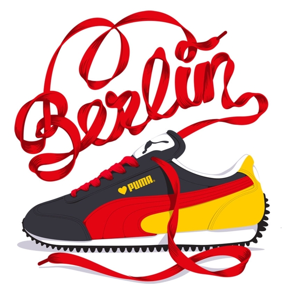
credit Alex Trochut via Behance
This is a very cool example of really stretching the boundaries of typography and doing something unique. There is a whole set of these for different international destinations.
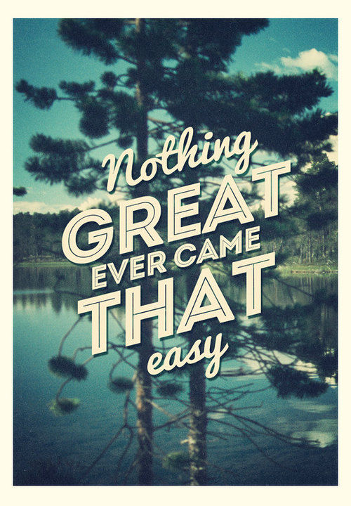
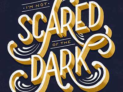
credit QueQuotes via Tumblr
This is a fantastic example of finding two totally different typefaces that work perfectly together. Somehow the flowing, hand-written script typeface actually compliments the all-caps, geometric, inline typeface – and they combine to support the quote by giving it a visual voice.
credit QueQuotes via Tumblr
Amazing 3D type treatment. Plus the addition of the swirls and the perspective of the image are awesome.
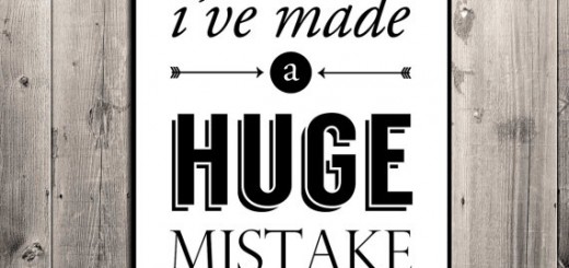
credit Drew Kora via flickr
Just plain awesome. The typography in the quote is fantastic.
See Also:
The Typography Series #1: The Basics
The Typography Series #3: The Bad.
The Typography Series #4: The Ugly

Pingback: The Typography Series #3: The Bad - The Spark()
Pingback: The Typography Series #1: The Basics - The Spark()
Pingback: The Typography Series #4: The Ugly - The Spark()